3 mobile lessons from Greenchoice.nl
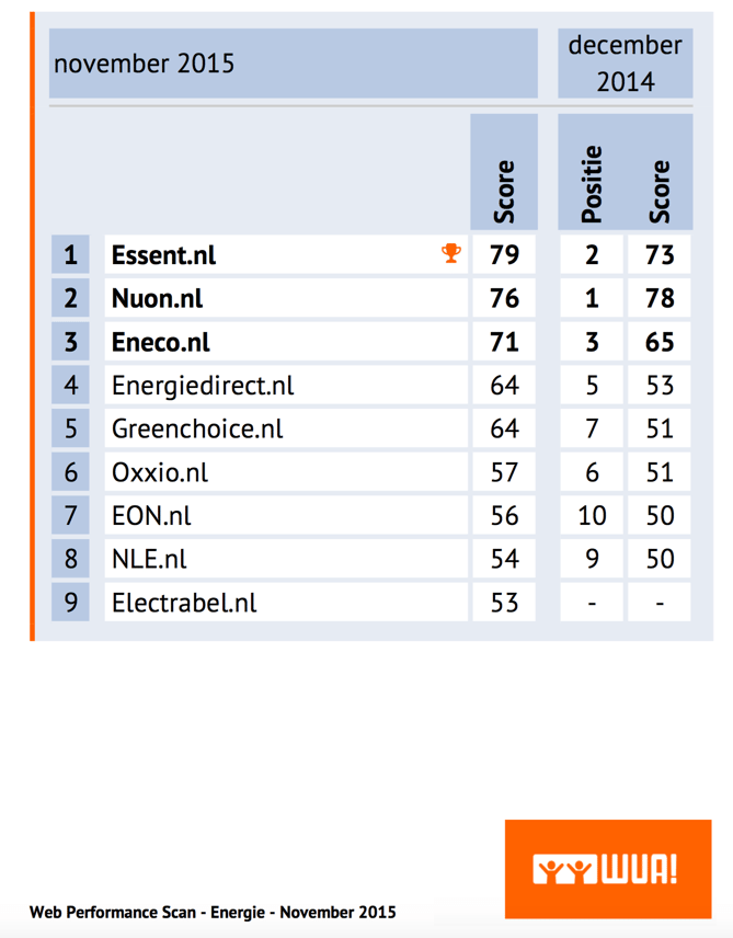
In November 2015 WUA! carried out an orientation study where a total of 400 potential customers went looking for a new energy contract on desktop and mobile. Essent was the winner of the mobile study with 79 points, and NUON.nl won the study on desktop and mobile.
Greenchoice.nl came fifth in the mobile study, and stood out due to a huge increase in score compared to the previous measurement (+13 points). What is going well at Greenchoice, and what can other providers learn from this company? In this article we explain how energy providers can make sure their mobile website really hits the spot with their customers on the basis of 3 mobile best practices and insights. Here we look at the aspects Greenchoice.nl performs better at than average.
1 Relevance is key
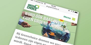
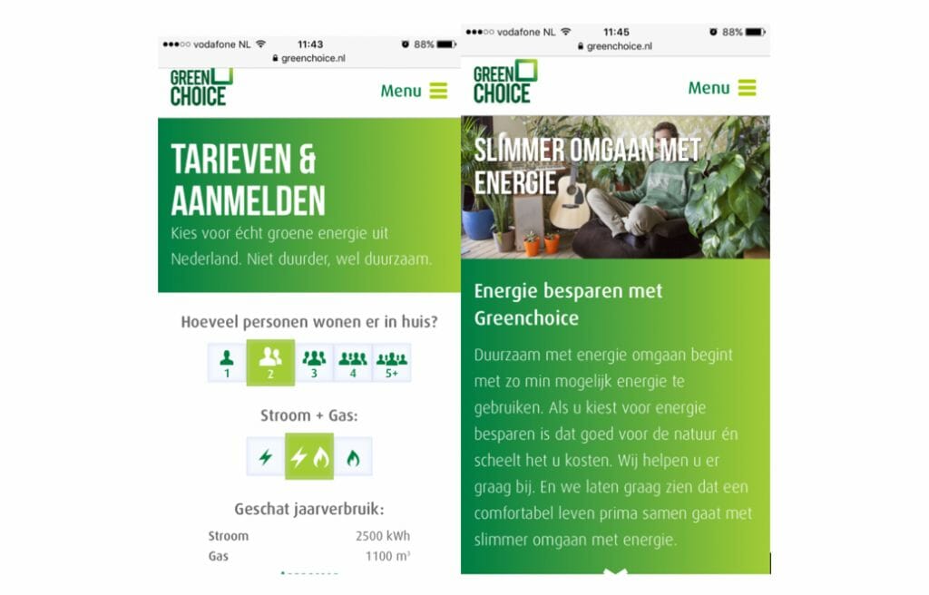
Whether a mobile site is able to clearly provide information at a glance or not is very important for smartphone website visitors. Greenchoice.nl does very well at this, looking at the high scores in the most recent WUA! energy orientation study. Both the homepage and the landing page where people end up after specific Google searches contain clear, relevant, and straight-to-the-point information. Whether it comes to energy saving tips or switching energy suppliers, Greenchoice.nl immediately provides website visitors with the relevant information. One of the potential clients said: “You can easily calculate the costs, the website works well on mobile.”
2 A really smartphone friendly website
Short, concise texts, clear call to actions, a slightly larger and therefore more legible font: these are all characteristics of a good, smartphone friendly website. Greenchoice.nl has understood this. Potential customers are very pleased with the look of the website and the readable texts. Greenchoice.nl manages to outdo established names such as Eneco.nl and Essent.nl in these areas.
Potential customers are very clear about it: “Fresh, business-like, short sentences, calm background, pleasant font and icons.”
3 Appealing offerings
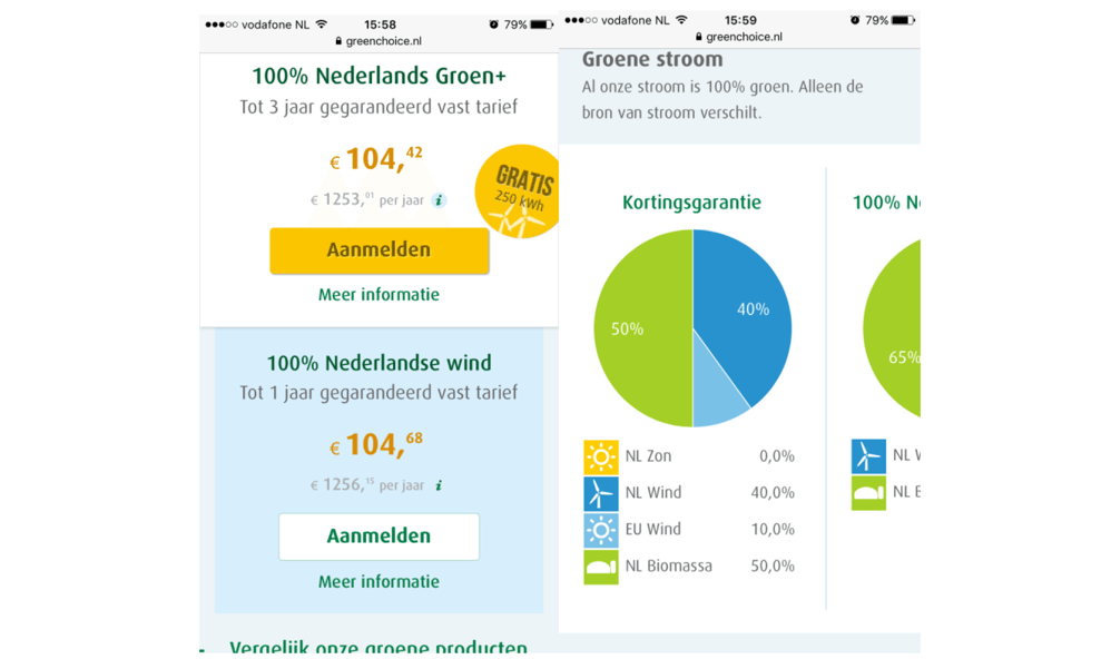
Appeal lies not only in price but also in the number of choices and the presentation of the offerings. Greenchoice.nl have these things in order. The energy provider offers competitive prices and presents the offerings very clearly, with three distinct tariff forms at the top and additional information immediately available behind a clear link. When you scroll further scroll down, the other information (such as the build-up of green energy) follows in order of relevance. It results in positive responses from several respondents: “You can clearly see the options.”
4 Ensure good findability!
These best practices of Greenchoice.nl are great, yet this provider ‘only’ comes fifth in the WPS ranking of the study on mobile and ‘only’ fourth on desktop and mobile combined. How is that possible? It’s due to poor findability: unknown makes unloved! Potential customers are able to find Essent.nl (68%) , Nuon.nl (66%), and Eneco.nl (51%) en masse. And of course getting preference as an energy provider starts with being found by consumers in the first place…