A card for every need: Chase stays true to her promise
In the Credit Card USA study (May 2019), consumers are happy with the Look & Feel + Offer of Chase. In the words of the consumer: “It was clear and easy and I could have easily found a card for anything I was looking for”. The website manages to give respondents the feeling that they’ve come to the right place. This is how:
Look & Feel of Chase: images that have a clear connection with the credit card offered
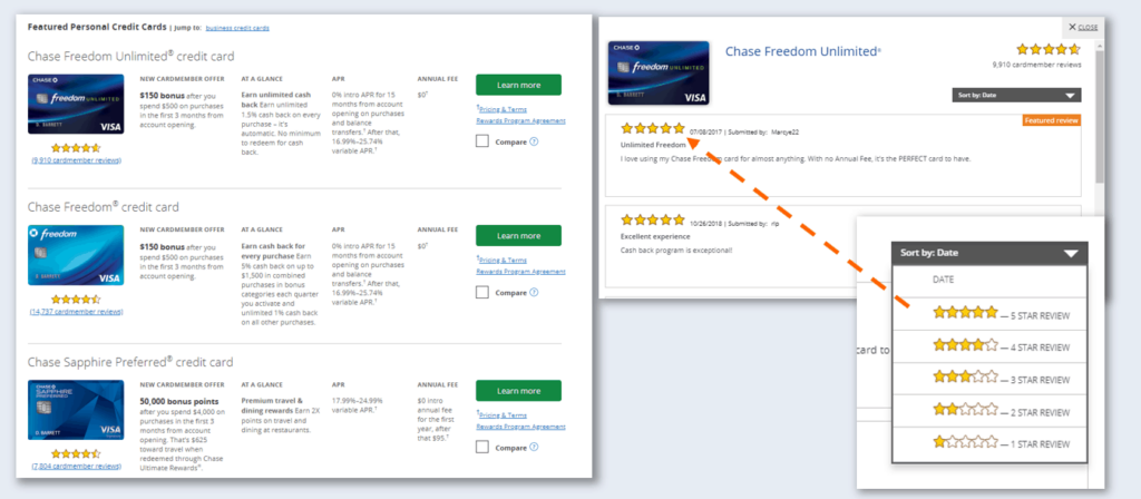
Chase displays images that have a clear connection to the specific credit card type. For example: an image of a travel destination for travel cards makes it clear to potential customers what that card can be used for. Feedback of consumers was: “Nice use of color- bars separating ideas.” & “Lots of images for easy searching without having to carefully read.” This resulted in a 7 points above average score on the question: ‘the images and pictures on this website appeal to me’.

Offer presentation: social proof intertwined with Chase offer
Chase.com’s landing page for credit cards immediately states: ‘A card for every need’. This is noticed by potential customer: they feel personally addressed by this statement. Upon scrolling down the website provides the visitor with images of different offers e.g. different card options.
Chase too recognized the importance of social proof in the form of customer reviews by showing a star-rating for every card. Scrolling down to the review section users get a first glimpse of what current owners have to say about the card. The ‘See all reviews’ button opens a pop-up screen with more detailed reviews. Chase also has a filter option to make the reviews more relevant based on date and the star-rating. This enables users to easily read about the perceived strong and weak points of the card.
One of many Best Practices
This best practice is one of many from our Digital Sales custom-made report. Learn from the best players in the market through best practices from the study as well as other industries in the WUA benchmark. With the Digital Sales Scan reports, WUA paints a crystal-clear picture for you of the best practices at screenshot level. Our experts will lead your team through problem areas on your website, and help your teams set priorities and concrete next steps. Stay ahead in the race against the competition and see what we can do to help you can to be the best.