Cinemas- PatheGaumont.com declared favorite because of easy and clear navigation
In the Night Out in France study, CinemasPatheGaumont.com’s website provided the best customer experience. The consumer indicated that they could easily locate the information that they required and that the information was clearly displayed. This is how Pathe Gaumont’s website does this:
Outperform all other websites when it comes to navigation and information
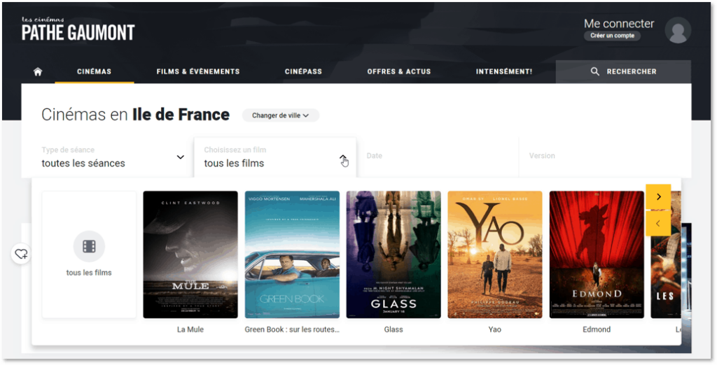
Pathe Gaumont’s website clearly displays its wide range of options. The menu is limited and the absence of a drop-down menu prevents the visitor from having too many options to click on. This creates a clear and uncluttered overview. Not only is the wide range of options easily accessible, so is the ordering process. A consumer describes: “the process is fluid and accessible; you can even select your preferred seat”.
“Call it what it is”: navigation made easy
Pathe Gaumont makes navigation easy by creating a smooth menu that only uses a few keywords. The menu headers are clear and self-explanatory; ‘cinemas’, ‘movies & events’, ‘cinepass’, ‘offers’, and more.
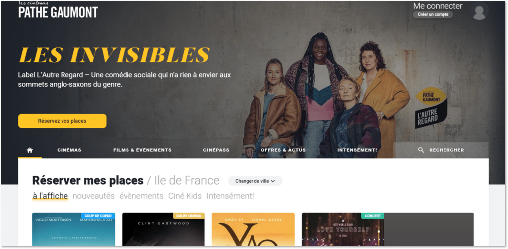
Imagery helpful in decision making
Once the consumer continues onto selecting ‘movies’, the website shows several pictures/images of movies that are currently playing in the cinema. This visually attractive filter option makes information easy to find and navigates costumers through the purchasing process in an exciting way.
Smart use of color
Color is an important visual cue. Green clearly means ‘continue’ or ‘available’ and red means ‘stop’ or ‘unavailable’. Pathe Gaumont’s website reflects this in the last step of their purchasing process where the customer selects a seat in the cinema. They use recognizable color coding (green for the seat you picked, yellow for available seats, etc.) in their purchasing menu.
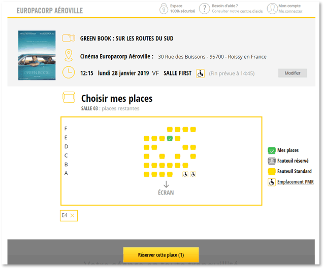
The website uses a calm color scheme. The simple color coding of black and white with a few additions of yellow make certain things, such as the movie posters, stand out. The few yellow accents draw the eye to various ‘next’ buttons. This helps in pointing the consumer to all the elements that are important on the website: how to reserve a seat and which movies the website offers.