How to influence consumer purchasing decisions
Competition on the web is tougher than ever. More and more companies recognise that in order to truly win on the web you need to know how consumers experience your competitors’ websites. How do you make sure the consumer will purchase from you? Read our analysis below.
The 3 most important conversion themes
Consumers base their choices on the three following conversion themes: the (1) Look & Feel of your website in combination with the (2) Offerings and perception of your (3) Brand. If you optimise your website with these three themes in mind, it will be translated directly into revenue. What should you look out for? Learn from the best in the market.
1. Look & Feel – is your website attractive and logical?
Let’s start with Look & Feel. What is it exactly? We define the Look & Feel of a website as the technical functionality of the website and the way in which products and services are displayed: the layout and the design.
Is the website logical? Is the consumer able to find the most relevant information at a glance? Does the website look attractive to the visitor? These factors are important to a consumer, and contribute to their final choice of a product or service.
How to get a high score on Look & Feel
Websites that are successful in terms of Look & Feel have in common that they have the right balance between showing all relevant information and leaving out unnecessary information. In addition, these websites allow the visitor to get to where they need to be with just a few clicks, namely the place where they can find the offer that is relevant to them.
Example 1: the Look & Feel of KPN.com
A good example is KPN.com. This website has risen 87 places in the WUA! Top 100 Best Websites 2015 in The Netherlands , partly due to the new navigation, designed with the customer in mind. Customers can immediately choose from the three most common actions in the area of ordering, making changes, or asking a service question.
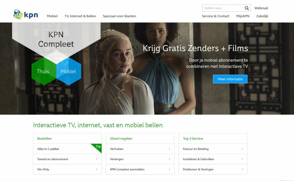
KPN has risen 87 places in Top 100 due to new Look & Feel
Example 2: the Look & Feel of Consumentenbond.nl
Another great example of a website that performs well with regard to providing the right information at the right time, is Consumentenbond.nl. Consumentenbond are able to offer their complex range of paid content, decision aids, and enquiries in an organised fashion.
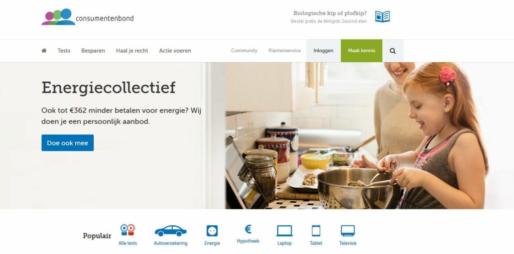
Consumentenbond know how to offer their content in an organised fashion
Make use of functional design
In terms of design, websites that score highest with consumers are mainly functional. Consumers definitely appreciate beautiful images, but only when they are relevant to the product category they are looking for. A good example of relevant images are the camping photographs on ANWBCamping.nl. People want to be able to see what the swimming pool, accommodation and campsite look like:
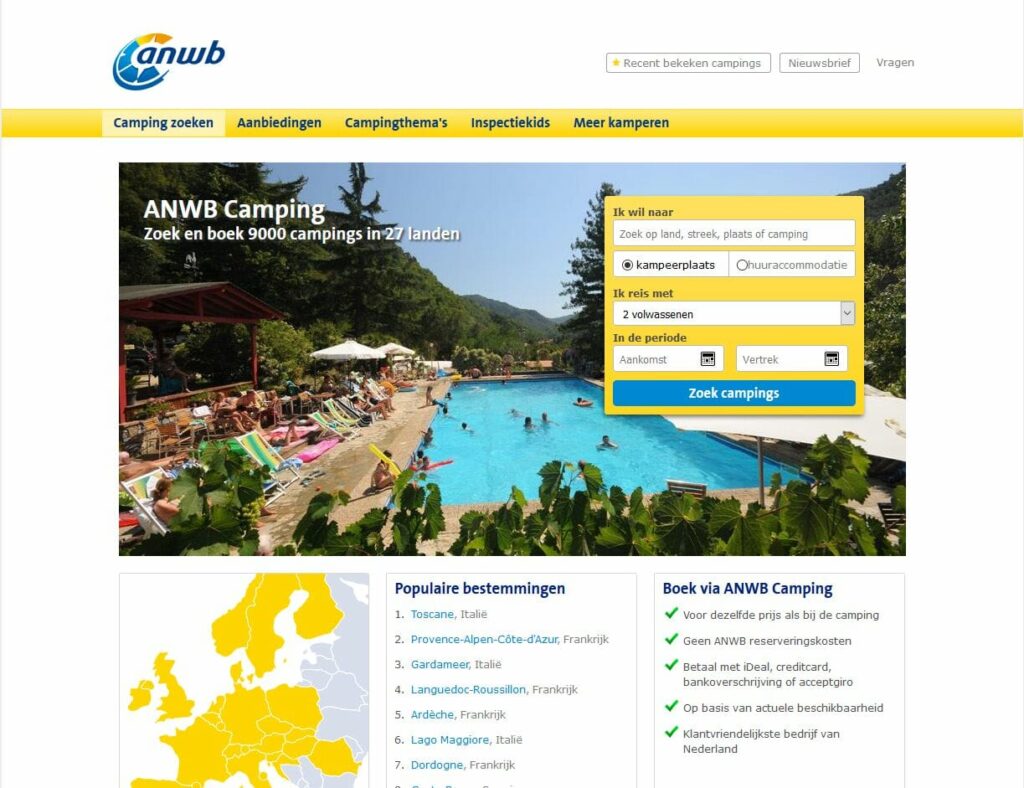
ANWBcamping.nl scores well mainly due to functional design
2. Offerings – to what extent does your website meet the needs of your customers?
By Offerings we mean anything that has to do with the product or service of a provider. This isn’t just about the number of products and their prices, but also the ease with which visitors can find the options that are relevant to them.
Immediately after getting to the webpage, the visitor’s assumption that the products they are looking for can be found there must be confirmed. A good example is the website of Arke.nl. Right at the top of the homepage, there are blocks with clear images and short text that show the most important holiday types for the coming season. You can also see last-minute options. If you’re having trouble finding what you’re looking for, you can enter a search term yourself directly below:
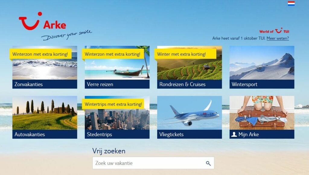
At Arke.nl visitors can see all holiday types at a glance
A good website aids its visitors
A decent website helps visitors make a good choice from the offerings. Fleurop.nl, winner of the WUA! Top 100 Beste Websites 2015, makes a conscious effort to achieve this. The company puts the most popular bouquets at the top of the homepage. Additionally, you can make a choice in the menu based on different occasions, such as congratulations or a special occasion.
Balancing choice
It is important that the offerings are provided in such a way that there is a balance between too much or too little choice. A large offering seems attractive at first glance, but it can cause consumers to get overwhelmed and lose track of what is available. Research has shown that people tend to postpone their choices when they are given too many options. For example, if you offer 24 types of jam in a shop, hardly anyone will buy anything. If you reduce the number of options to 6 types of jam, one in three consumers will buy a jar.
A nice example of a website that offers its visitors a good range of options is Gazelle.nl. This website receives a high score from consumers with regard to offerings. On the homepage you can put some checkmarks into a form, which immediately returns a list of the most suitable bicycles:
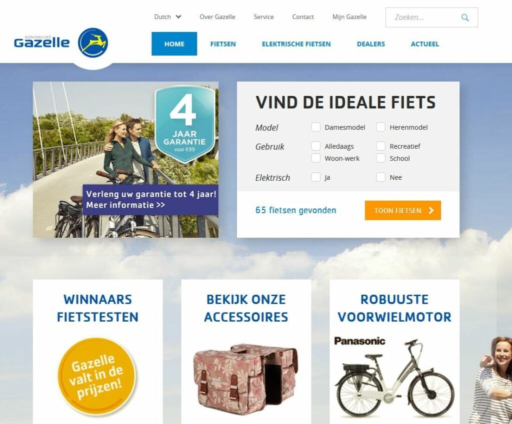
Gazelle.nl has a good balance of choice, and therefore receives a high score
3. Brand – gain trust and keep your promises
A consumer who wants to buy something on a website wants to feel like the party behind that website is trustworthy and will deliver what it promises. In order to be seriously considered as a provider, a brand/provider must comply with two conditions.
Condition 1: Stick to your words
A very important condition for consumers is that any claims made on your website are accurate and inspire trust. So make sure that there are no inconsistencies in the way in which your company presents itself to the outside world. Your brand, offerings, and the look & feel of your website all need to add up.
Successful brands on the internet have a consistent, believable, relevant, and clear promise. ANWBCamping.nl scores well in this area. Directly on the homepage you can see a number of claims that suit the ANWB brand and that inspire trust, such as “The same price as at the campsite”, “No ANWB reservation costs”, and “The customer-friendliest company in The Netherlands”.
Make sure that the organisation behind the website is optimally arranged, so that you can actually fulfil your promises. A common problem for instance, is that the back office is unaware of internet promotions because departments aren’t working together properly. Make sure that your back office processes are seamlessly integrated with your online activities, so that you fulfil the promises on the website and strengthen people’s trust in your company.
Condition 2: Be open to contact and dialogue
A brand should convey that the company looks after its customers. An important part of this is being open to contact and dialogue: the brand must be accessible. This is partly reflected by the ease with which you are contactable.
A good example of a website that shows that the company is open to contact is KLM.nl. The Contact button is a prominent feature on the homepage. When you click on it, you can immediately see the length of the response times on Facebook and Twitter, and you can see in which ways the company can be contacted:
Afbeelding 6: KLM.nl is open to contact and therefore scores well
Well-known, established brands have an advantage
Well-known, established brands have an advantage. ANWB.nl, KLM.nl, and Fleurop.nl frequently grace the top 3 in their markets. These brands are trusted and consumers have high expectations of their service.
Increase trust in your brand
What can you do to increase people’s trust in your brand? If your company is a well-known player with Dutch consumers, you’re already ahead. In that case, it is mainly important to consistently keep your promises, be open to contact, and show this on your website.
Is your brand less well-known? Be extra sure that your website inspires trust, so that new visitors become interested. Make use of quality labels and substantiate your claims. Remove any inconsistencies that may exist in the claims you are making, and make sure that you can be contacted in as many ways as possible.
How do consumers experience your website?
Would you like to know how consumers experience your website compared to those of your competitors? Do you want specific recommendations, so that you can increase your website’s performance and therefore the conversion? Read more about the WUA! Web Performance Scan or contact us.
Many industry leaders already have.
