How UX on WerkenvoorNederland.nl convinces job seekers
In the Recruitment study, conducted in May 2019, WerkenvoorNederland.nl (national government) was declared favorite. The study was conducted among 360 jobseekers on both desktop and smartphone. This article dives deeper into the desktop experience of the job seekers. In this, the website offers ‘a wide variety of jobs’ and it looks ‘well-organized’. The WerkenvoorNederland.nl offer is easily scannable, without taking away from the information it provides. The government convinces job seekers when they explore more information about the jobs on WerkenvoorNederland.nl:
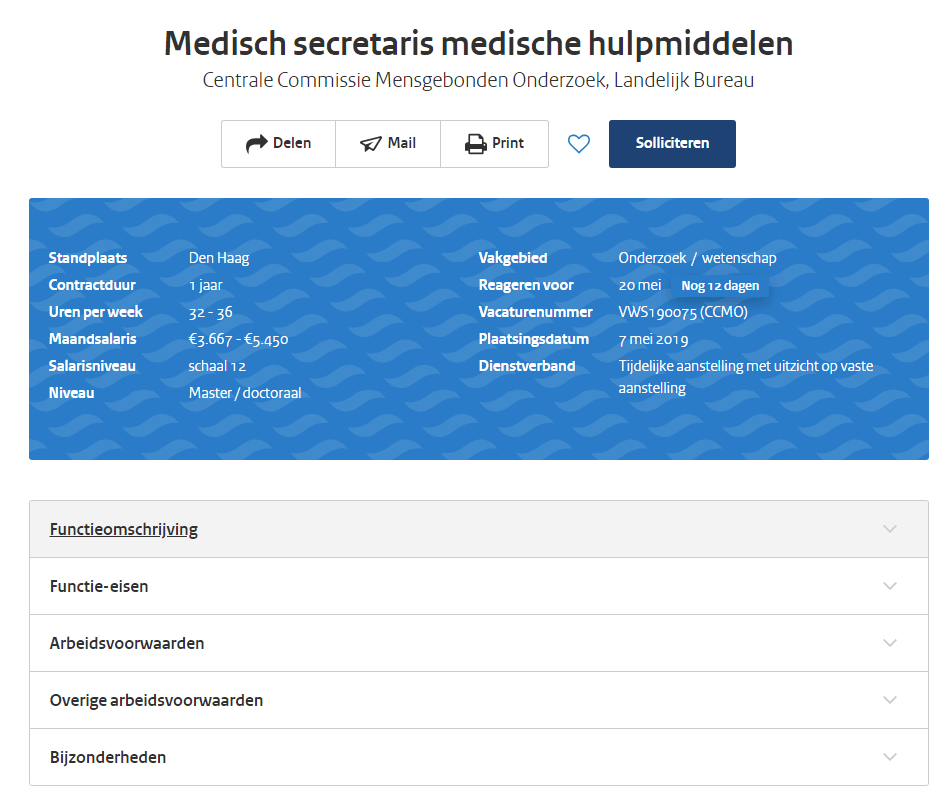
Vacancies are easily and quickly scannable
In the vacancy overview, the government provides a short summary of all information. The job title provides a description of the job, the subtitle then mentions the section of the government that the job falls under.
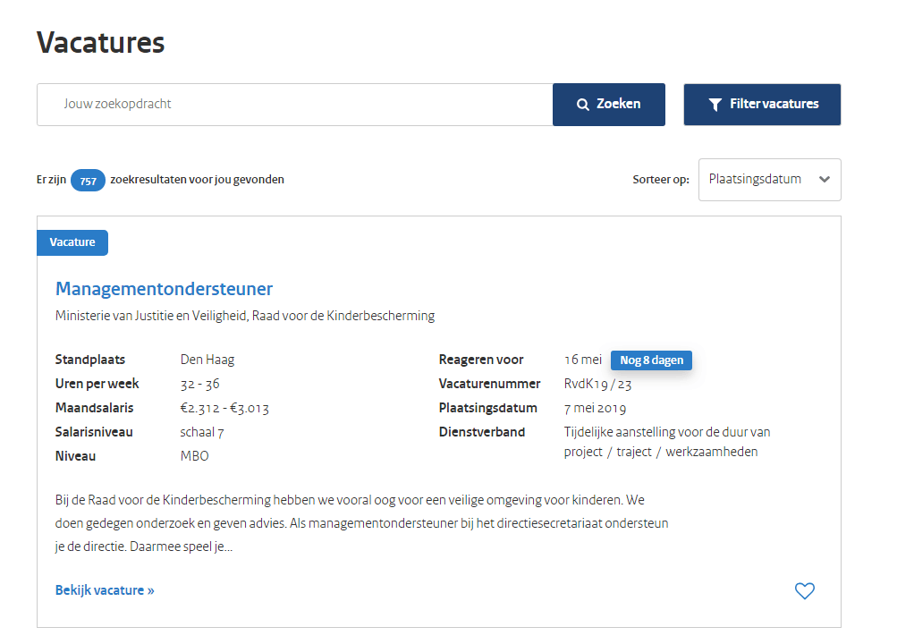
It also shows the most important elements next to each other, including the job’s location, expected number of working hours a week, an indication of the salary, and the type of contract (temporary, permanent). Thanks to the short, three-sentence description, job seekers instantly get a feel for whether the vacancy is interesting enough to click on.
Support color blue is cleverly used to draw job seekers’ attention
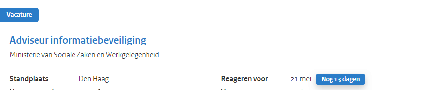
Aside from the government’s dark blue color, the WerkenvoorNederland.nl website uses a lighter blue as support color. This is used to draw the attention of website visitors. The words ‘vacancy’ and ‘view this vacancy’ are shown in blue. This shade of blue is also used to create urgency. Next to the deadline, it mentions the number of days applicants have left to apply for this job.
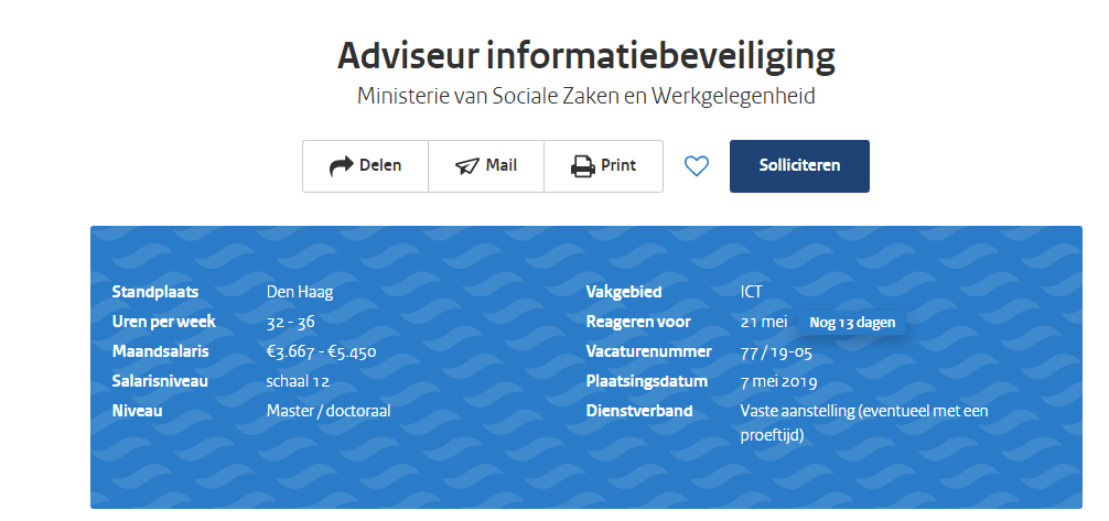
Vacancies well-organized and structured
When clicking on the vacancy, the information provided is “clear”, respondents say. For instance, respondents mention the website “provides a lot of information about the job” and “the information the government gives is to the point and clear.” Once again, the job title stands out, in a larger font than the rest of the text. The blue support color is also used again, this time to show the summary of the vacancy in a blue field.
The vacancy text starts with a short bit of text that explains more about the department the job seeker would come to work at. This text is in italics. The text about the actual contents of the job is then right below this.
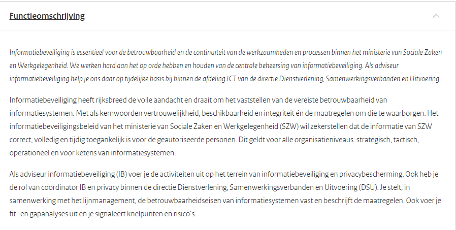
The requirements for the job, conditions of employment, other conditions and other relevant information are in clickable tabs. The information under each tab is short and to the point, but does show the most important information. The conditions of employment are repeated, as are the secondary conditions of employment such as parental leave and study options. Under other relevant information, the website provides information about the date of the job interviews, the further process of the recruitment procedure, and the address the interviews will be held at. In the words of one orienting applicant: “wide variety in offer – clear explanation.”