How WUA measures conversion and offers insight into market share in your industry using The Bubble Chart
The digital sales game consists of many elements, but if you “flatten” it, it really boils down to two decisive factors: website traffic and conversion. One could make it more complicated, but what really matters is the number of visitors (traffic) on a website who decide whether or not to make a purchase (conversion). In this article, we show how WUA defines conversion, and through an example from our recent personal loan study, we show how we give insight into markets using the “Bubble Chart”.
WUA’s definition of conversion: Findability & Preference
Over the past ten years, WUA has asked more than 250,000 consumers to spend an hour searching for a particular product or service. Based on our extensive benchmark questionnaire and validated model, we always want to know:
- Which providers’ websites consumers come across;
- What they experience on these websites, and
- Which website do consumers ultimately choose to buy, and why?
We call this final choice ‘Preference’ or ‘First Choice’, and we express it through percentages of all consumers sampled.
Findability: If you’re not found, you won’t convert
In order for consumers to state their preference for your website they must, of course, have landed on your website in the first place, for example through advertisements, direct traffic, or via a search engine. It is a truism: if you’re not found you’ll never convert, and therefore you’re not taking part in the online sales game. At WUA, we define the term Findability as the percentage of consumers who evaluate a particular website during their online search for a specific product.
Preference: The number 1 in the market according to each consumer
This is the answer to the question: “Which website would be your #1 choice if you were to buy or apply for product X?” After all: if a website succeeds in attracting and keeping a visitor on their website for a longer period of time, then the intention is to have this visitor decide to purchase a product or service. We always ask, “Which would be their number 2 choice in the market?”, and who would be their 3rd choice. And: what would these numbers two and three need to improve in order to become the number 1 in the eyes of that consumer?
Download the Personal Loan Insights Report for more data, insights, and visuals.
Conversion: The extent to which a website is able to convince consumers
Next up is conversion. In the world of WUA conversion is Preference percentage (%) divided by Findability percentage(%). In other words: to what extent is a website able to convince web traffic to choose that website or provider? Good to know: when we talk about conversion at WUA, we are talking about the approximated metrics from our studies, not about absolute conversion based on a website’s real sales figures.
Market insights: The “Bubble Chart” of Findability, Conversion, and Preference
With our Digital Sales Scan, we map out markets using hundreds of respondents. Both on performance and on digital experience. In the graph below you see findability, preference, and conversion at work. At WUA, we call this the ‘Bubble Chart’. Below a few starting points:
-
The horizontal axis shows Findability: the percentage of consumers who find and evaluate a website during their search for a specific product or service.
-
The vertical axis shows Conversion: the percentage of website visitors a provider is able to convince that website?
-
The graph shows the relationship between Findability and Conversion. At the bottom right of the graph are websites that are frequently found but manage to convince relatively few of these visitors (Conversion).
-
At the top left are websites that are highly convincing, but not often found.
-
The size of the circle is determined by the absolute Preference for the website within the industry. That is how many of the respondents choose this website. The larger the circle, the higher the Preference.
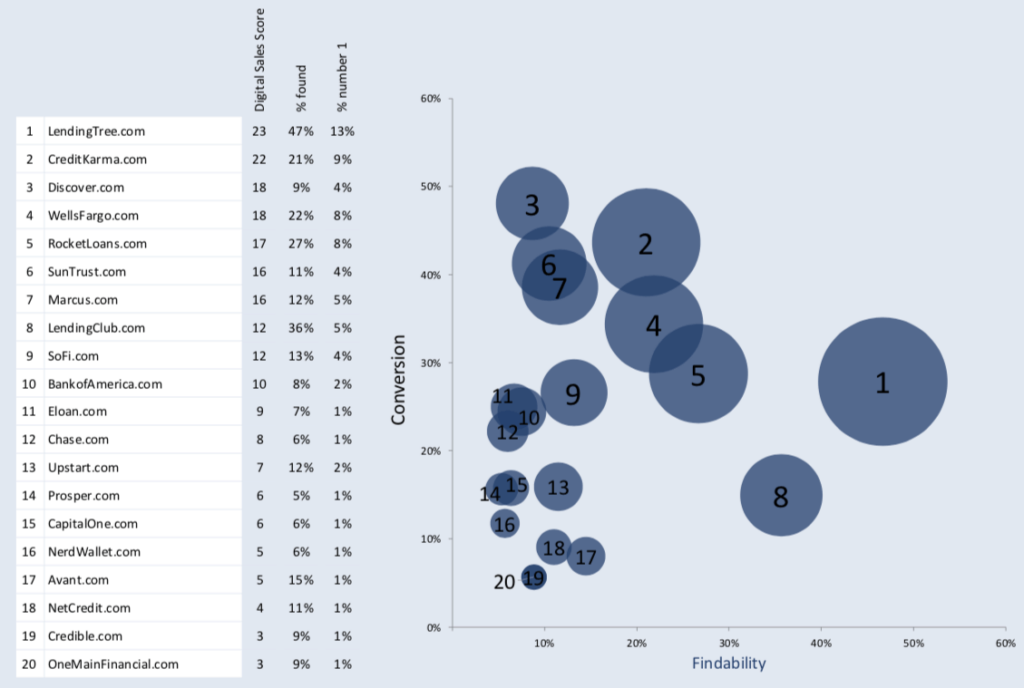
The Personal Loan Bubble Chart
In November 2018, WUA studied the personal loan market in the United States to discover the top competing websites and the best practices to learn from. Here are some of the top insights we can take from looking at the bubble chart.
- The sheer number of websites found by at least 5% of respondents (the cut off for a Digital Sales Score) speaks to the splintered nature of this competitive market.
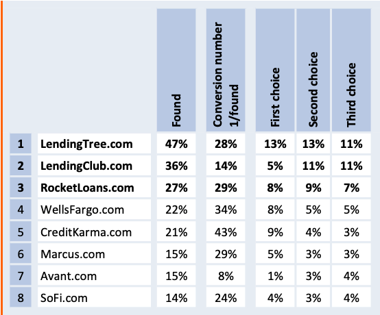
- LendingTree.com leads the pack as the most found website with a conversion that’s in the middle of the top 20 websites. In markets dominated by a ‘Winner Takes All’ player, the conversion rate should be much higher. Think Amazon.com in books or smart speakers, among other products.
- Discover.com acts as a ‘love-brand’ with a small following that will always choose it, with a conversion rate closing in on 50%. As a bank that is most known for its credit cards, this warrants a closer look to understand its success. It also poses a threat to the rest of the market if it cranks up findability through SEO, SEM or general marketing in personal loans.
- LendingClub.com is the 2nd most found website in the bunch, but only ranks 8th in the Digital Sales Score. Such low effectiveness indicates a very high customer acquisition cost relative to the rest of the market.
- Finally, the top of the pack (2-7) have a great opportunity to gain new market share by improving the customer journey on their websites. These sites already have many aspects of their website right and can increase conversion with the right adjustments.
The Goal and Relevance of the Bubble Chart
Overall, the Bubble Chart offers in a single glance how the market performs when it comes to Findability (web traffic), Conversion and Preference (new market share). Each website wants to see their market placement improve, and that’s exactly what our Digital Sales Scan seeks out to do.
Want to know what the Digital Sales Scan can do for you? Contact us today to learn more about the place of your website in the market and how to improve it.