Navigation lessons from Bol.com and Coolblue
Bonus: Get the winning tactics from market leaders in retail
Time to learn some lessons from the experts in navigation: Dutch retailers Coolblue and Bol.com.
Both retailers have inventory that runs to thousands of SKUs – how can they guide customers to the right product in just a few clicks?
How do they offer the best range of options, while keeping away choice overload?
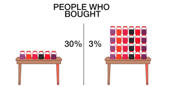
We investigated the user experience of 400 consumers as they shopped for a specific item. This study revealed that many consumers struggle with deciding among too many choices.
Two retailers, Coolblue and Bol.com stood out as offering an exceptional user experience. They succeed in reducing the stress involved in making a ‘feel-good’ choice. Let’s see what makes them so successful.
These are the lessons we learned.
Lesson 1: Make searching clear and easy from the start
Bol.com has optimized their home page, so product searches are narrowed down early on. They employ mutually exclusive choices and collectively exhaustive categories. This quickly guides the customer to the right product.
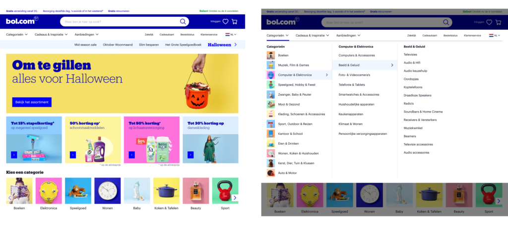
It’s all about creating and using categories that do not cause any overlap between product groups.
Bol.com helps customers identify which categories contain the “right” product for them.
The images above the subcategories provide visual cues. These make the site more navigable without needing to read a lot of text.
Lesson 2: The power of effective filters
Bol.com offers effective filters within each category. These cut down the huge product range into a more manageable number of choices.
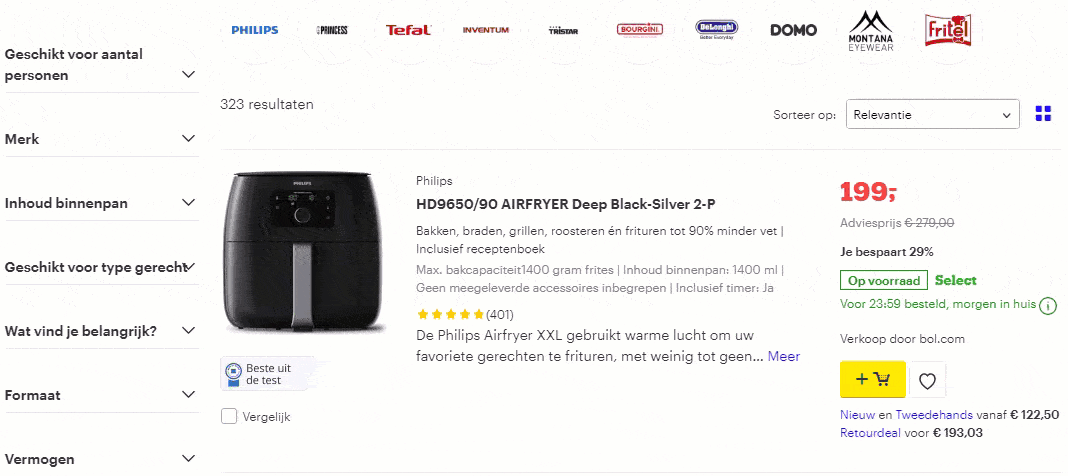
Customers can filter by product features; or by descriptions, like brand, “best tested,” price, delivery options, customer reviews, and more. Plus, the filters can be hidden – which keeps it tidy.
A well-designed filter should be predictable, jargon-free and listed in order of priority – the customer’s priority.
Still can’t choose? Don’t worry, Bol.com offers a decision-making support tool.
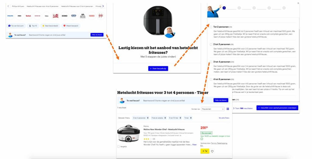
By asking a few questions, Bol.com selects products that match the shopper’s specifications.
Lesson 3: Comparing is caring at Coolblue
Customers are often searching for a solution, and not so much a specific product or SKU. This means they want to compare options. You don’t want them clicking away or getting ‘cold feet’, so Coolblue answers this need with easy comparison charts.
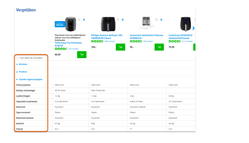
Shoppers can compare the differences between products, and the dropdown menu makes it easy to compare differences in product features.
As a result, shoppers feel more confident and better equipped to make a feel-good choice.
Lesson 4: Boundaries: set the right guardrails
Steer shoppers toward the right choice. Put yourself in the customer’s shoes and make things easier for them.

Offer them the option of narrowing down a large product range to a limited number of choices that are easy to compare. Fewer options is easier to manage.
Give them the tools they need to find exactly what they’re looking for.
The more thought you put into how customers interact with your site, the greater your chances of creating loyal customers and generating repeat business.
Here’s what some of the survey participants said about Bol.com:
“Good filters and decision-making support. Nice that you can compare.”
“The search filters are effective and there are more of them than I expected. That helps you make the right choice, despite the wide range of products.”
“There are so many products, but if you apply the filters, you narrow it down to the right choice.”
…and about Coolblue?
“There is a wide product range but you can easily compare products. The filters help you make the right choice.”
“You can click on various air fryers to compare them. You can see multiple products side by side. Nice!”
“There are lots of products to choose from, but the filters make it easy to make a choice.”
Get the winning tactics from market leaders in retail
We’ve selected the most effective tactics used by market-leading companies, Coolblue, Bol.com, The North Face, and KPN. Don't miss out on these tactics and download them today.