Planting red tomatoes: How to always catch online visitors’ attention
Wouldn’t it be great if you could immediately grab the attention of every visitor to your website? To spark their interest and lead them in the right direction? To make sure they see exactly what you want them to see?
Well, guess what: you can!
As discussed in a previous article, making a good first impression is all about having images that match your product and brand values, along with easy-to-scan text and concise headers. You’ll also win extra minutes of screen time with a value proposition that is instantly clear during those precious first 10 seconds your potential customer spends on your page.
But what if your customers don’t see your carefully crafted value proposition and USPs? Or have a hard time finding the most relevant information? In that case, read on and learn how you can take control of your visitors’ attention.
Form and function
Web design has 2 basic functionalities: an aesthetic side and a functional side. These 2 sides work together to create an appealing, easy-to-use website.
- When it comes to aesthetics, your website should be at least somewhat pleasing to the eye. It also needs to match your product and brand, and instill the right feeling in your visitors. This can be best compared to the design of a physical store: it should look nice, well-kept and clean, and generally give customers a positive feeling about what you have to offer.
- The functional side of design is about helping visitors understand how to use the website and creating hierarchy in the content and navigation. Again, think of a physical store. If you’re a shopkeeper, you wouldn’t want your customers to wonder where they are or where to go next; it should be clear where to start, where the help desk and check-out counter are, and, of course, the special offers must stand out. The exact same applies to your website.
When we talk about the functional side of web design, there are 2 methods that have been proven to help you guide your visitors’ attention. These are 1) the Law of Common Region and 2) the Isolation Effect.
1. Grouping information together
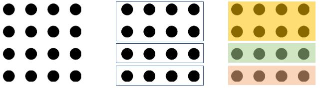
The Law of Common Region is a law of perception based on Gestalt psychology. It’s actually a set of laws that explain how humans make sense of their visual environment. It states that elements that share a region or space are grouped together as one. Usually, a webpage contains multiple pieces of content that should be viewed as one piece; for example, a section on your brand, a navigation section, a news section and so on. Creating multiple groups out of one can be as easy as using boxes or background colors. Your visitor will immediately see that the page contains 3 different pieces of content instead of one.
Here’s what this looks like in practice: Essent.nl has won the hearts of consumers in the last three WUA Sales Scans, partly because it is so easy to scan and explore.
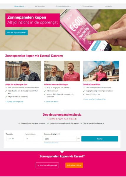
The different sections of the page are easily discernible from one another: There’s a header with the main proposition, a section with a white background that highlights product features and USP’s, a third section in grey that starts the sales funnel and, finally, a pink section where customers can immediately request a quote or get advice. The information is clearly grouped together, so visitors can scan the page for the content they’re looking for.
Note how the orange button on the pink background stands out most visibly. And this brings us to the second highly effective method for structuring your website’s content: the Isolation Effect.
2. Isolation Effect
Now that your visitors can actually see that your page has multiple pieces of content, it’s important to create a visual “hierarchy.” That means making it clear which items you want to stand out more than others. Start with the order in which content is presented. With mobile content, order of appearance is your main tool (more on this topic coming soon!). With computer screens, you have more space to work with, so you can fit more information onscreen. The abundance of information causes your visitor’s eyes to wander on the page, though. That’s why you have to latch onto their gaze and hold it!
The most important information has to stand out. The element that “screams” loudest will always attract the most attention. This is called the Isolation Effect. Nobel Prize-winning psychologist and economist Daniel Kahneman explains how people have “a tendency to act on information that stands out and differs from the rest. When the item in question stands out less, the likelihood of it being remembered also decreases.”
So, remember: you can (and must) take control of your visitors’ attention by making some elements stand out more than others. In the picture below, the red tomato clearly stands out from all the green tomatoes in the background. This makes it the item with the greatest visual impact. Compare this effect with the second image: all the sunflowers are equally bright in color. As a result, none of them stands out from the rest.
The key takeaway is that if all your CTAs and content are equal in color and size, they all lose value!


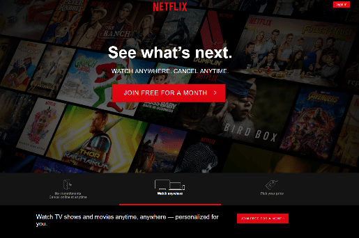
Here’s what this looks like on a website: In our entertainment study (USA 2019), Netflix takes the isolation effect to the next level, with a black page that contains 2 clear “red tomatoes.” The concept of a brightly colored CTA seems simple enough. However, many websites ultimately fall in the “sunflower field” trap by planting too many other equally highlighted elements on the same page.
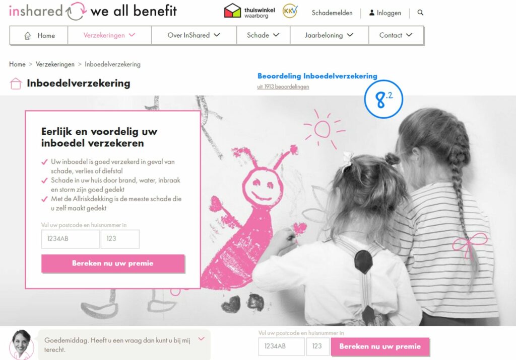
Making the rating stand out to take control of their visitors’ gaze
Inshared is a Dutch insurance provider. Eye-catching pink is the main color used on their site, except when it comes to their customer satisfaction rating! As an online-only insurance provider, being perceived as reliable can be a challenge. By making the rating stand out most, they take control of their visitors’ gaze.
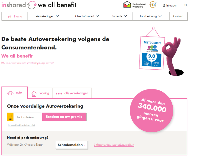
Their current page uses moving elements to catch the visitors’ attention even more. So, color is not the only tool at your disposal when it comes to attracting attention. Motion, size and basically anything that stands out will do the trick!
The Law of Common Region and the Isolation Effect are 2 proven tools that let your potential buyers easily grasp your page and see the unique value of your product. So, when choosing a web design, always start with the most important question: What do you think your customers need to see first? By answering that question first, you’ll be well on your way to a higher conversion rate.
Do you want to stand out from the crowd?
WUA empowers companies to sell more online. Achieve higher customer satisfaction and increase user experience and conversion rates by focusing on the consumer perspective. We believe in benchmarking customer journeys. We have data of all relevant players in the Automotive, Finance, Insurance, Travel, Retail, Public Sector, Telecom and Energy sector! Schedule a demo or call to see if we have data available for your website.