The truth behind the saying: “A picture is worth a thousand words.”
We live in a fast-paced society where instant gratification has become the norm. The internet has become the number one tool to satisfy our impatient quest for both knowledge and entertainment, but not all websites have adapted accordingly.
Readers do not read a website the same way they read a book
Research by the Nielsen Norman Group (NNG) shows that website visitors only read an average of 20% of the available text. A website is not read the same way as a book, but more like an advertisement that gets put in your hand while you are trying to catch the train. When we scan a text we search for keywords, summaries, informative (sub)headings, and images. What do you do when your zealous content marketeer does not want to part with their extensive prose? Remind them that an image truly is worth more than a thousand words.
Once you start, you are half finished
The user experience within the first 10 seconds on a website is critical and determines whether or not someone sticks around to find out more. “Does this page have what I’m looking for and is it worthy of my precious time?” For the next 20 seconds, people are still likely to leave. Within that short timeframe, the visitor determines if the website is worth their time. The headings, bullet points and images must display the right information about your brand or product to capture the visitor’s eye and hold their attention. Research shows that you can actually win minutes of screentime with a clear (value) proposition in the first 10 seconds.
Text versus image
We now know that 80% of the text on a website is not read by the website visitor. This tells us that explaining things in more detail is not the solution. Text is a relatively recent invention. Our prehistoric brains are not necessarily geared towards text just yet. Images are processed 60,000 times faster than text; an image is recognized in just 13 milliseconds. Furthermore, 90% of the information that reaches our brain is visual.
So, in the limited amount of time people use to decide if they are going to stick around, significantly more convincing information is conveyed using images, keywords, and bullet points that explain or illustrate your message.
Choosing the right image
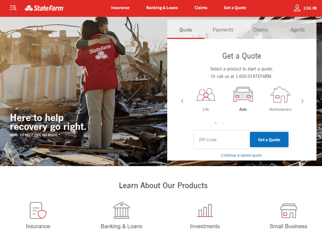
Images play a major role in the search for information, as long as the images are actually informative. Informative in this context means ‘relevant’: the images complement the written words or illustrate brand values. State Farm presents a good example: the brand value “Here to help. Now and in the future” is supported by an image of a State Farm representative comforting someone who has just lost their home to a hurricane.
“I like the picture and the saying they had on their opening page. It had two people standing and hugging where their house used to be. It said, “let us help you recover.” It is good to know that a company can relate to that kind of pain and suffering.”
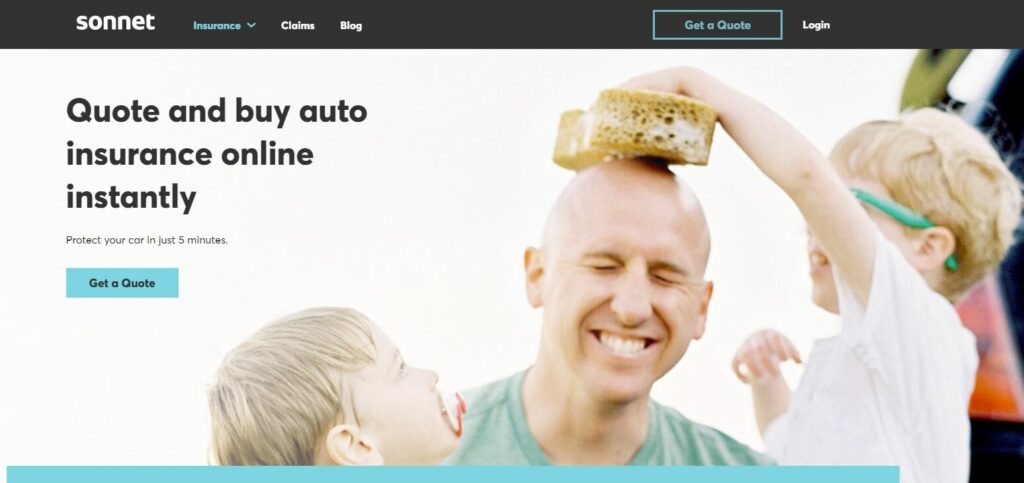
A bit less heavy on emotion but building on the same principle is Sonnet, a Canadian insurance provider that sells car insurance. An image of a father cleaning his car together with his kids is fun, relatable, and relevant. Other images on their webpage display their main proposition: ‘Buy auto insurance online.’
In our research, we still see many companies that decide to use an image of a pretty face behind a laptop, a man in a suit pretending to use his phone or smiling people all around. Images that are merely decorative are largely ignored, while informative images are actually viewed. The rule here is that the first image sets the tone. If the first image is a decorative (stock) image, the rest will be ignored, making it more difficult for you to make the most out of those precious first ten seconds.
How to catch the reader’s attention in 30 seconds
There is certainly truth to the saying “a picture is worth a thousand words.” As long as this image is informative and accompanied by text that is organized by keywords, bullet points, and concise headings. This is how you can catch the reader’s attention in 30 seconds:
- A clear value proposition buys you minutes of screen time
- Use keywords, bullet points, and concise headings
- Images should be relevant to the message and must either display your product or illustrate brand values