Trust and advice in the online lending market: Not a salesperson, but an advisor
In the online lending market, trust is an important issue. In the most recent WUA! study of taking out a loan (article in Dutch), respondents clearly indicate that they don’t always like to borrow money, and that it has to feel right. In this industry, a good website needs to do more than just provide information about the price.
Advisory role
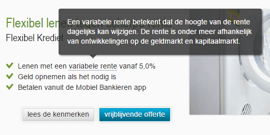
It is important that a website makes a potential customer feel like the provider has their best interests in mind. It is essential to use clear language, the terms and conditions must be crystal clear, and any questions must be answered quickly. In the most recent WUA! online orientation study of taking out a loan, ABNAMRO.nl and Rabobank.nl managed to do well at these tasks by not assisting the consumer as a salesperson, but as an advisor instead.
Terms are explained, and advice is focused on the client’s wellbeing. This makes potential customers feel like the provider isn’t trying to get the most out of the situation, but is committed to the customer’s wellbeing. When visitors are asked why they would recommend Rabobank.nl to friends or family, the answer is: due to the ‘honest advice’.
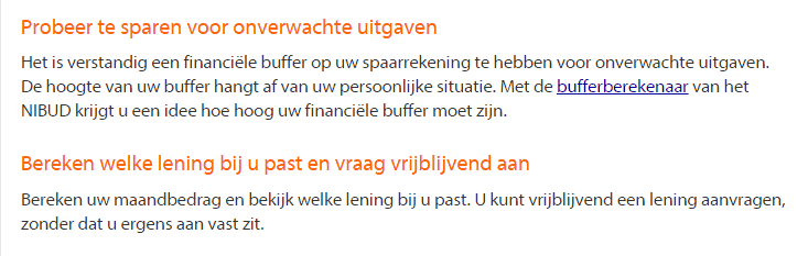
Bron: Rabobank.nl
Bron: ABNAMRO.nl
Immediately relevant on smartphone
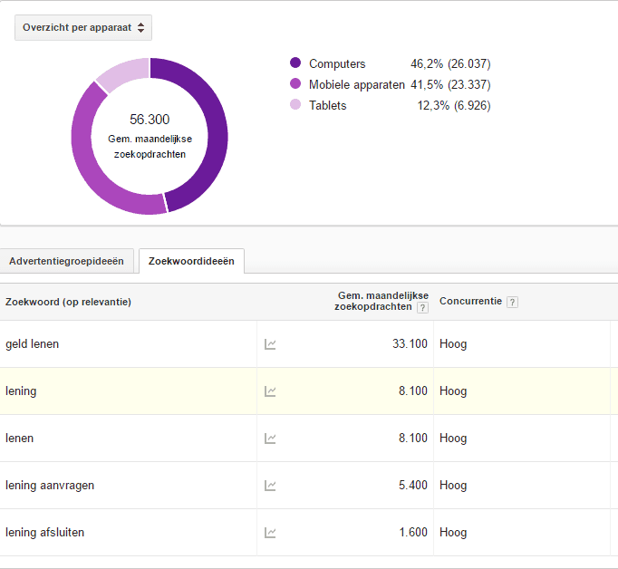
The orientation study of taking out a loan (article in Dutch) was carried out on desktop and laptop, as well as smartphone. Although the importance of mobile traffic in the Dutch online market needs to further explanation, the platform is used in a different way than desktop and laptop for this specific industry. During the 2 measurements, between 86% and 90% of consumers indicated that they prefer to take out a loan using a desktop computer. However, that doesn’t mean that the mobile platform is not important. More than half of all searches for popular keywords in the lending market come from mobile devices.
Quickly relevant on a smaller screen
For websites, it is therefore clearly important to have a decent mobile equivalent in order to provide these mobile visitors with advice as well. Because of the smaller screen size, one of the bigger challenges is to become relevant quickly. The best performing mobile website in this study is Freo.nl. On both the homepage and the landing page, Freo.nl clearly communicates that the visitor has come to the right place to apply for a loan. In order words: the product is immediately visible.
Although, as mentioned earlier, further information provision is very important, at least the visitor already knows that they are in ‘the right place’. When asked about what they really liked about the first impression of Freo.nl, a respondent commented: “specialised in loans, you can see this immediately on the homepage.”