What you want to know and ask about the improved WUA model, the Digital Sales and CX Score and our new questionnaire
In this article, we told you more about that WUA improved their questionnaire and improved the Digital Sales Model. From now on, the overarching score (Web Performance Score, or in the UK and US the Digital Sales Score) will be divided into two scores, the Digital CX Score and the Digital Sales Score, because it no longer tells us enough to offer a complete picture of what is happening within a market. We are aware that, after reading this article, you might have questions.
We wrote down a couple of those questions and provide you with an answer. Get in touch with us if you want to know more, we would love to give you a clear overview of this project and everything around it.
What is happening to the benchmark?
The WUA benchmark will continue to exist. For questions that have not changed, we can continue to compare at question level with scores calculated prior to the innovation. For questions that have been added, or have been modified, we will no longer compare at question level, but at theme / construct level. On the basis of a number of studies that we’ve run in parallel (new and old questionnaire), we have created a conversion formula with which the old data can be compared to the new data.
Was there something wrong with the old model?
The WUA Web Performance Scan model was and remains a good reflection of what the online customer journey looks like in different markets. However, the online experience is constantly changing, and the WPS model is growing in this. This will happen continuously with small leaps, and once every few years with a big leap, like now. And although the model is now fully up-to-date, we will continue to ensure that we’re mapping the online consumer experience as accurately as possible in the future.
Aren’t you missing some information if the model has fewer questions?
The goal of a good questionnaire is to get the most and best information and insights with as little questions as possible, with which we can ultimately predict consumer preferences. When there are too many questions, there is a lack of overview and too much overlap between what these questions measure. We have found that a number of questions from our old model were very close to each other and therefore largely measured the same thing. We have deleted those questions. In addition, the long questionnaire increasingly made respondents feel tired and less motivated.
Furthermore, there were a number of things missing from the old model that have become increasingly important in the online customer journey over time. We have added those elements.
Finally, we have also improved the open questions we ask. They now provide richer feedback. And it is precisely the open questions that ensure that we do not overlook matters. After all, the respondents can decide for themselves what they answer, and therefore tell us from their own perspective what they think is good and less good about the websites they visit.
How does this affect the ability to compare with previous measurements?
We validated the new model using a number of studies that ran parallel to studies using the previous model. As a result, we have been able to create a conversion formula with which we can convert old data into a comparable score in the new model. We can do this at theme level (brand, product, etc.). For individual questions we can only do it if the question hasn’t changed substantially.
How is it possible that our website scores seem to be lower than in previous measurements?
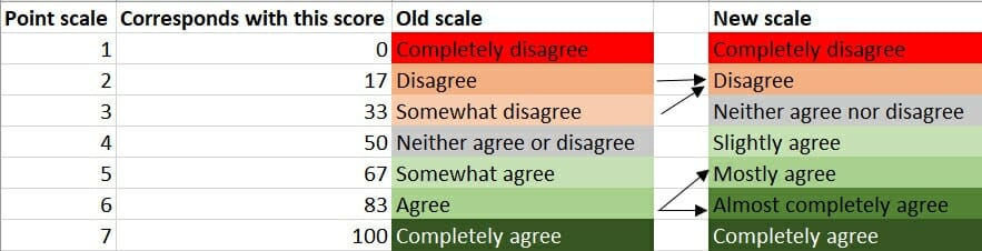
An important factor in determining the scores in our reports is the scale we use. This is a 7-point scale for most questions. However, we have changed the answer options. We saw that a large proportion of respondents gave the answer “Largely agree”. We now offer a larger number of positive answer options than negative answer options. This gives the respondent more opportunity to differentiate their (often positive) opinion. The effect of this is that we are better able to measure the difference between a good website and a reasonably good website. The differences between the scores of websites are, on average, larger. An effect is also that the scores tend to be slightly lower.
This does not mean that a website with a lower score performs less well. Websites that perform equally well, will see a similar decline. What we have actually done, is set the bar higher.
The overview below shows the change in the scale. The arrows show the effects that we see in the data.
What’s happened to the Web Performance Score?
With the Web Performance Score (WPS), we gave an indication of the total online performance of a website with the help of a single figure. We noticed, however, that this one score does not provide a complete picture of reality in all studies. This is why we have decided to calculate two total scores for each website:
UX score
A representation of the total experience on the website for a visitor of that website. The score consists of a weighted average of the assessments on Brand, Product, and Look & Feel.
Performance score
A representation of the total online performance of a website. This score reflects findability and conversion.