WUA innovates: New Digital Sales Model and Questionnaire 2018
The online world is constantly changing, and rapidly. Since WUA! began to map the online customer journey in 2008, the average website has improved significantly. The consumer has also changed; they have become more agile digitally and have higher expectations of websites.
This trend is clearly visible in the graph below, in which the percentage of respondents who continue on a website after the first impression (as measured in the WUA! studies) has been plotted over time. It is clear that fewer and fewer respondents drop out after a first look at a website to continue searching for another website. This can largely be explained by the improved online experience that websites offer.
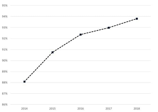
Figure 1. Representation of the continue percentage of respondents in the WUA! WPS model between the years 2014 and 2018. The line is an average of the automotive, banking, energy, retail, telecom, travel, and insurance markets. This graph clearly shows that fewer and fewer respondents indicated that they would drop out early on the website they visited.
Because the average experience on websites has become increasingly better, for WUA! it has become increasingly important to measure exactly on which elements websites can make the difference. In other words, the difference between 6 out of 10 and 8 out of 10 is easier to measure than the difference between 8.2 and 8.5 out of 10.
At WUA we have been continuously working on improving our products over the years. About a year ago, we embarked on a major step in improving our Web Performance Scan (WPS). To achieve this, we have worked on several levels: what we measure (our model), and how we measure it (the respondent experience), and we have also taken a close look at the reporting and optimized it.
The questions we asked ourselves are:
- Are we measuring all the elements that play a role in the online customer experience on a website?
- Aren’t we measuring elements that are of minor importance?
- Are we measuring this in the most effective and efficient way?
How we tackled this: It all starts with data
Rome wasn’t built in a day. In a number of steps we adapted, tested and optimized, our measuring instrument.
We started with a meta-data analysis. A fresh look at more than 100,000 website reviews taught us a lot about which questions allow us to best measure the online experience. But we also learned a lot about how the respondents fill out the questionnaire, where they dropped out, and how we could improve the experience for the respondents.
All questions have been re-analyzed, statistically and in terms of content. Is the formulation of the questions well understood? Are we really asking what we want to know? During many brainstorming sessions with our digital experts, we have (re)worded the universal online customer journey and converted it into a questionnaire. We have put a lot of time into determining what we mean by all the concepts we measure.
And to be 100% sure that we didn’t overlook anything, we categorized thousands of open answers. What does the consumer say about what’s important when visiting a website? This resulted in a number of additional elements that we have integrated into our model.
The new model, with all the improved questions, is being tested in a number of rounds. First of all in a qualitative pilot, where we invited respondents to our offices to fill out the questionnaire and provide us with feedback on the questionnaire itself. Among other things, we learned that the way in which we measured the first impression no longer corresponded with how consumers actually get a first impression of a website. This concept has led to a strong improvement in the way we record this in the new model.
Then we tested the new questionnaire in 2 large-scale quantitative pilots. After each round, we answered the following questions using statistics:
- Are the questions coherent in the way we intended in our theoretical model?
- Does every question we ask add something to the model?
- With the help of the questions we ask, can we ultimately predict which website the consumer will prefer?
(For the statisticians among us, we applied factor analysis, correlation, and reliability analysis and regression analysis respectively!)
Based on a thorough analysis of more than 3,000 website reviews, we have chosen the very best questions, with which we can measure the online customer journey as well as possible. This has led to the questionnaire becoming 1/3rd shorter, while the statistical strength of the model and the information received have increased significantly.
First impression
An important difference is how we visualise the first impression. We have learned that the consumer is much less extensive and more intuitive when it comes to getting a first impression of a website than we thought. We have adjusted the questionnaire accordingly, and also the instructions that we give to our respondents. This makes it much easier to measure what happens when a consumer takes a first look at a website. We ask fewer but clearer questions about the first impression. We focus on a real first impression, which for most consumers lasts for 30 seconds or less.
The content of the elements in the Further look phase
Another important difference lies in the content of the elements of Look & Feel, Product, and Brand. All elements have been supplemented with a number of aspects, and some less relevant aspects have been removed. An important change is that we determined that the overarching theme of Look & Feel is subdivided into 3 separate subconstructs, namely:
- Overview and information
- Appearance
- Technical functioning
By measuring these 3 elements separately, we can also give better and more focused advice on how to improve the Look & Feel.
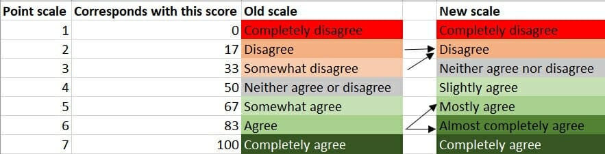
Scale
As previously noted, websites have become much better over the years. The assessments that respondents gave were therefore becoming more positive. We noticed that the scale of answers that we used was no longer adequate. We saw in the response patterns that the answer ‘Largely agree’ was very commonly given. This is why we wanted to give respondents the opportunity to present their (positive) opinion in a more nuanced way. Therefore, we have chosen to use a scale with 4 positive, 1 neutral, and 2 negative answer options. As a result, we can better measure the differences between (good) websites.
Survey tool
At the same time, we developed a new way of questioning. Our brand new survey tool offers a greatly improved experience to the respondent. Participating in the research therefore does not only take less time, but it has also become more fun and playful (click here for a demonstration of our new survey tool). The fact that the questionnaire has become considerably shorter has a positive influence on the motivation of our respondents (and this, in turn, leads to improved data quality).
Furthermore, we have built in a number of smart control options that enable us to filter respondents who aren’t trying very hard from the data even better and partially automatically. And this also results in better quality data.
What’s in it for you?
In short: happier respondents, even better data, even better reports, even happier customers.
The shorter questionnaire, which is also more fun to fill out, leads to an improved respondent experience. And this leads to more motivated respondents. And more motivated respondents lead to better answers. We see this both in the reviews, which now offer a more nuanced picture, and the open answers, which now contain richer feedback.
The validation study shows that the number of respondents who drop out during the research decreases. In addition, our data check shows that we have to reject fewer respondents because they did not try hard enough. This makes it easier for us to fill samples, even for difficult target groups.
At question level, the data has improved because we get more spread in our answers. This leads to a more accurate and reliable representation of the consumer experience in a score. We see the improvement of the data reflected in a higher predictive power of the model. With the help of the elements of the experience we measure, we can predict in 80% of cases which website the consumer will ultimately prefer. This means that we measure (almost) all relevant components of the customer journey in our model. By optimizing the questions and improving the first impression phase, the model is a more accurate reflection of the real online customer journey.
The reporting will become clearer and better, because we will report on fewer, but all-important elements. This makes the researchers’ work more effective and enables us to produce a higher quality report even faster. For the customer, the report will become more logical and clear. Our reports will contain fewer pages, with more information presented in a clear way.
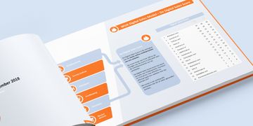
An example of this is the renewed appendix, which displays a large amount of data in a well-organized way.
We are proud and will continue to improve ourselves!
We are proud that we have achieved our goals with this large-scale project. Because, ultimately, we will be able to help our customers even better to increase their conversion, and thus to become and remain the best in the online world. We are looking forward to your feedback, questions, remarks or vision on our improvements. Don’t hesitate to get in touch with us and we would love to help you with your digital challenges.